Cover Talk with Shannon Messenger

 I love talking to authors. Our experiences are so similar, yet so very different, that every one of us has a new story to share. Everyone says that the moment you get your cover it really hits you - you're an author. The cover is your story - and you - packaged for the world. So the process of the cover reveal can be slightly panic inducing. Does it fit your story? Is it what you hoped? Will it sell? With this in mind I put together the CRAP (Cover Reveal Anxiety Phase) Interview.

13445306.jpg

Today's guest is my fellow Lucky13s and Friday the Thirteeners member Shannon Messenger, to talk about her awesome cover for LET THE SKY FALL, available from Simon Pulse in March, 2013.

Did you have any pre-conceived notions about what you wanted your cover to look like?

Honestly? Not really. I had a much stronger sense of what I DIDN’T want it to look like than what I wanted, so mostly I sent a lot of silent, “please don’t let it have _____” wishes into the void and danced for joy when I saw the final cover.

How far in advance from your pub date did you start talking covers with your house?

Pretty early, actually. Even in my first round of edits there were notes in the margins of certain scenes marking them for possible cover ideas. And during The Great and Never-Ending Title Debate (LET THE SKY FALL was VERY hard to title) my editor gave me some information on what they were thinking for the cover to try and help inspire some title ideas.

Did you have any input on your cover?

Yes and no. My editor and I are (fortunately) very much on the same page, so mostly she told me what they were doing and I said brilliant things like, “Ooo, that’s going to be awesome!” I did get to see headshots of the models they’d selected for the photo shoot ahead of time, and offer some suggestions on how I’d preferred them to be styled (all of which were met with: yep, that’s what we’re planning!), but on the whole it was all the amazing team at S&S doing what they do best.

How was your cover revealed to you?

In an email from my editor where she gushed and gushed about how amazing it was for several paragraphs and I did my best to be a good author and read all of that despite the fact that all I really wanted to do was DOWNLOAD THE ATTACHMENT AND SEE IT.

Was there an official "cover reveal" date for your art?

Yes, though it was a bit of a rushed scramble. Within a couple of weeks of finalizing the art I found out that LET THE SKY FALL was going to be featured at a special S&S event the week of BEA and that ARCs would be given out. Which—while AWESOME—meant we needed to do the reveal before that event, and there wasn’t a lot of time to organize. So we settled on revealing May 30th, which gave me a couple of weeks to prepare, but was still before everyone would start traveling for BEA and be too distracted to be checking blogs.

How far in advance of the reveal date were you aware of what your cover would look like?

Only about three weeks. Like I said, it was a bit of a last minute scramble.

Was it hard to keep it to yourself before the official release?

YES! Keeping secrets is never easy for me. And since we were scrambling to prepare for that event, I kept getting exciting things I couldn’t share. Like, they sent me my ARCs, but I couldn’t post the obligatory Shannon-Hugging-Her-Book photo (what? It HAS to be done!) because the cover was still secret. Same with when the bookmarks I’d ordered came in, I *almost* forgot and posted a picture of them on Twitter. Thank goodness I remembered at the last minute and stopped.

What surprised you most about the process?

How MUCH I loved the final cover. It was SO MUCH BETTER than what my imagination had come up with.

Any advice to other debut authors about how to handle cover art anxiety?

Yes, two things. One: try not to panic until you actually SEE the cover, because nine times out of ten authors end up loving what their publisher sends them. And if you do happen to fall into the category of not liking your cover, trust your agent to help guide you through. There’s a lot that can still be done and I know many authors who started out with something that wasn’t right and ended up with something awesome!


Cover Talk with Elsie Chapman

I love talking to authors. Our experiences are so similar, yet so very different, that every one of us has a new story to share. Everyone says that the moment you get your cover it really hits you - you're an author. The cover is your story - and you - packaged for the world. So the process of the cover reveal can be slightly panic inducing. Does it fit your story? Is it what you hoped? Will it sell? With this in mind I put together the CRAP (Cover Reveal Anxiety Phase) Interview.

13401993.jpg

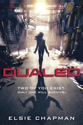
Today's guest is my fellow Lucky13s and Friday the Thirteeners member Elsie Chapman, to talk about her awesome cover for DUALED, available from Random House February 26, 2013. 

Did you have any pre-conceived notions about what you wanted your cover to look like?

Not at all, actually. A lot of the time, I have a hard time pin-pointing why I like or don’t like something, only that I do or don’t. I was just hoping that when I saw what my publisher came up with, I would simply fall in love with it.

How far in advance from your pub date did you start talking covers with your house?

Over a year in advance. Which seemed early at the time, but looking back, I’m so glad they got a head start on it. So many people are involved with the cover process, and there’s a lot of back-and-forthing which takes time.

Did you have any input on your cover?

My editor and DUALED’s art director presented me with concepts and ideas and asked for feedback. I really appreciated being asked for my opinion, and it was great that they were interested to hear my thoughts on everything!

How was your cover revealed to you?

Step by step, in that they’d tweak, come back to me, we’d all talk, then they would tweak some more. By the time I actually saw it, I already had a good idea what it was going to look like. But seeing it all actually finalized—with the title on it, my name and picture, the tagline and blurbs—it was an overwhelming moment. It just hit me that this was how DUALED was going to be presented to the world.

Was there an official "cover reveal" date for your art?

Not really, but my editor gave me the heads up about when my publisher would be releasing it online, so I could plan my own reveal ahead of time if I wanted to go that route.

How far in advance of the reveal date were you aware of what your cover would look like?

With the finalized version, about a week or two, I think.

Was it hard to keep it to yourself before the official release?

It was! I really wanted to share it, but I’ve learned to be a much more patient person now, with the publishing process being what it is. So I try to keep in mind that all good things take time.

What surprised you most about the process?

How involved it is, and how much thought is put into every single detail. From the font to title placement to whether or not any special effects such as gloss or foil will be used. And as much as it is an art and a super creative process to put together a cover, it does make sense that the sales and marketing department also has a say in the final product.

Any advice to other debut authors about how to handle cover art anxiety?

To always remember that your publisher wants nothing but the best for your book, and for it to succeed. And that they know more than we do about what works for a cover. So trust that they’re going to do an awesome job, just as they trust you to do the same when it comes to filling the pages in between!

Cover Talk with A.G. Howard

I love talking to authors. Our experiences are so similar, yet so very different, that every one of us has a new story to share. Everyone says that the moment you get your cover it really hits you - you're an author. The cover is your story - and you - packaged for the world. So the process of the cover reveal can be slightly panic inducing. Does it fit your story? Is it what you hoped? Will it sell? With this in mind I put together the CRAP (Cover Reveal Anxiety Phase) Interview.

Here today to usher in the new interview on Writer, Writer is my fellow debut author A.G. Howard. She's a great gal that I knew back when we were just anonymous screennames bouncing off the same agent entries over on QueryTracker, so I'm thrilled to be sharing the astounding cover for her book SPLINTERED, available from Amulet in January, 2013.

Did you have any pre-conceived notions about what you wanted your cover to look like? 

I did. I’m very visual and I actually like to “construct” my own book covers for fun sometimes. I always assumed it would be a dark gothic-type cover with Alyssa as the centerpiece and some sort of symbolic details woven in, like maybe the broken toys and the bloody roses. Here’s the mockup I made:

Granted, I was WAY off in the color scheme. But once I saw what they had done, I was thrilled. Choosing vivid colors lent a whimsical feel which is so important, so the reader goes in knowing to expect some strange silliness along with the creepiness. The model is beautiful, but also looks very innocent, like my MC. I also loved the fact that Alyssa’s face is partially covered by her hair (speaking of her hair, the model’s is exactly how I pictured it!!!).  One thing both our covers had in common was the actual vision: Alyssa front and center, and plenty of subtle details woven in (the bugs and flowers who talk to her, the snaky vines, the key around her neck, and her wild and haggard expression, because believe me, she goes through some crazy stuff…heh).

How far in advance from your pub date did you start talking covers with your house? 

November, so about three months after I signed.

Did you have any input on your cover? 

Yes. My agent arranged a “Meaningful Consultation” clause in my contract, which meant I got to watch the entire evolution and actually had back and forths w/my editor along the way. But honestly, their ideas were so amazing, I hardly had anything to say. Although there was a lot of swooning going on. LOL

How was your cover revealed to you? 

Since I was involved throughout the process, it was a gradual evolution. My editor would send me mockups along the way to view and comment on.

Was there an official "cover reveal" date for your art? 

There was a little bit of confusion there, because I’d told my editor I wanted to do a reveal, so they needed to let me know before it hit the online catalogue and went live. Then I was googling myself one weekend, and there it was, up in the catalogue. I emailed my editor LIKE FAST and she wasn’t even aware they’d already posted it. It had only been up that one day. Evidently, designing and editing are kind of worlds apart even though they’re both in-house. She did some checking around for me (this was on a Saturday, mind, so she really went out of her way there) and got the okay for my reveal. I had been in contact with a very delightful gal named Tami, who runs the lovely Krazy Book Lady blog. I appreciate her so much because she was so flexible and pushed aside everything so I could post it first thing Monday morning before anyone else got wind of it on the catalogue. I spent all day Sunday making my book cover reveal trailer, and then it all went off without a hitch. Whew!

How far in advance of the reveal date were you aware of what your cover would look like? 

The day I contacted my editor that the cover was in the catalogue, I actually had to make sure that was the final version because there had still been a little back and forth going on between the designer and the artist. So, two days before the reveal, unless you count watching the evolution.

Was it hard to keep it to yourself before the official release? 

Well, I have select group of online pals (my critters/beta readers) that got to watch every step of the progression w/me. That helped me reign in my excitement until I could share w/the world.

What surprised you most about the process? 

I didn’t realize it took both a designer and an artist (two separate entities) to make up the cover. I always assumed it was the same person doing both. But instead, the in-house designer looks for a freelance artist who has the qualities in their artwork that would best capture the book’s feel. Really, it’s pretty amazing how many people actually had a hand in it along the way. The model, the artist, the designer, my editor, the publicist. LOTS of involvement in-house and out of house.

Any advice to other debut authors about how to handle cover art anxiety? 

Have your agent get a Meaningful Consult clause in your contract. It really does help if you get to have a little input, if for no other reason than you get to see the progression of the cover, and fall in love with it along the way!