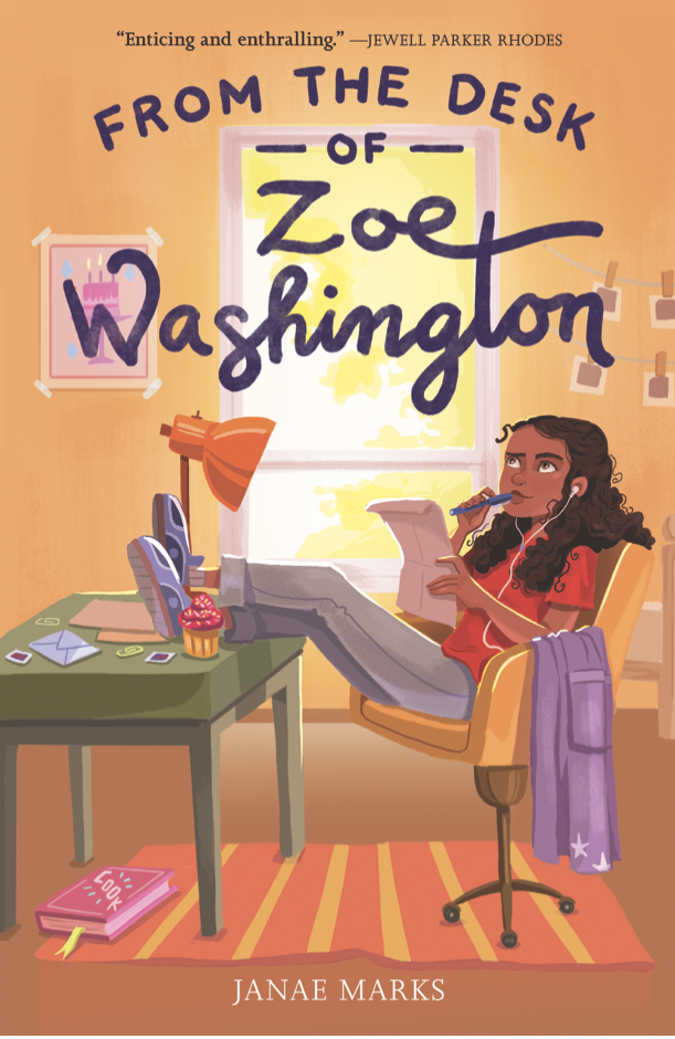
Janae Marks: A Debut Novelist & Her First Cover

I love talking to authors. Our experiences are so similar, yet so very different, that every one of us has a new story to share. Everyone says that the moment you get your cover it really hits you – you’re an author. The cover is your story – and you – packaged for the world. So the process of the cover reveal can be slightly panic inducing. Does it fit your story? Is it what you hoped? Will it sell? With this in mind I put together the CRAP (Cover Reveal Anxiety Phase) Interview.

Today’s guest for the CRAP is Janae Marks, who has an MFA in Creative Writing with a concentration in Writing for Children from The New School. She grew up in the suburbs of New York City, and now lives in Connecticut with her husband and daughter. From the Desk of Zoe Washington is her debut novel.

Marks.png

Did you have any pre-conceived notions about what you wanted your cover to look like?

I knew I wanted an illustrated cover, and since that’s common for middle grade books, I was pretty confident that was the direction my publisher would take. What I really wanted was for my protagonist, Zoe—a Black girl—to be featured on the cover. Since children of color are underrepresented in children’s literature, I wanted it to be clear from the cover that this a story about an African American girl. My only other wish was that the cover wouldn’t be too feminine. I have no problem with those kinds of covers, but I wanted mine to appeal to a wider audience.

How far in advance from your pub date did you start talking covers with your house?

My editor’s assistant reached out to me in October 2018, eight months after I got my book deal, and about fourteen months before the book’s publication date.

Did you have any input on your cover?

Yes! First, my editor asked if I had any cover ideas. She said she couldn’t promise that the design team would be able to incorporate my suggestions, but they were open to hearing my thoughts. I sent descriptions of two scenes that might look nice as illustrations on the cover. A month later, my editor emailed me sample images from an artist they were considering. I loved the samples, but unfortunately that artist wasn’t available. A few weeks later, my editor sent samples from another artist who was available, Mirelle Ortega. I loved her work as well, so I was happy with this pick.

How was your cover revealed to you?

In December 2018, my editor emailed me two cover sketches that Mirelle had created, and asked me which one I liked better. Off the bat, I was happy they’d incorporated some of my cover ideas. I took a few days to think it over, and decided I liked the right image best.

Screen Shot 2020-03-28 at 1.40.30 PM.png

In March 2019, nine months before my pub date, I received the final cover art! I didn’t have any input into the colors they chose, but I’m really happy with the color scheme. This cover is exactly what I dreamed of, and I love everything about it!

Was there an official "cover reveal" date for your art?

When my editor shared my final cover, she let me know that it could be revealed in June 2019, within two weeks of the Winter 2020 catalog going live. We revealed it on Mr. Schu’s blog, Watch. Connect. Read.

How far in advance of the reveal date were you aware of what your cover would look like?

I saw the final cover in March 2019, but couldn’t share it online until June!

Was it hard to keep it to yourself before the official release? 

Yes! I saved the image on my phone and would show it to family and friends when I saw them in person. But I couldn’t wait to be able to share it online for everyone to see.

What surprised you most about the process?

I was surprised by how much input I got, since I’d heard that authors don’t often get a say. The process was so easy, which I’m grateful for since I know it can be stressful for some authors.

Any advice to other debut authors about how to handle cover art anxiety?

I think my experience was so positive because of the input I was given. If possible, let your publisher know what ideas you have for your cover! If there’s something you don’t like, work with your agent to let them know. Hopefully, in the end, you’ll end up with a cover both you and your publisher love.

Parker Peevyhouse On Sharing Your Aesthetic With Your Cover Designer

I love talking to authors. Our experiences are so similar, yet so very different, that every one of us has a new story to share. Everyone says that the moment you get your cover it really hits you – you’re an author. The cover is your story – and you – packaged for the world. So the process of the cover reveal can be slightly panic inducing. Does it fit your story? Is it what you hoped? Will it sell? With this in mind I put together the CRAP (Cover Reveal Anxiety Phase) Interview.

Today’s guest fro the CRAP is Parker Peevyhouse, whose most recent novel, The Echo Room (Tor Teen 2018), is a science fiction thriller for young adults which Kirkus called "a thrilling ride" in a starred review. Her next novel, Strange Exit, will be available from Tor Teen in January 2020.

Did you have any pre-conceived notions about what you wanted your cover to look like?

When my editor asked me for my initial ideas, I had just one vague thought: it’d be cool if my cover followed the style I’d seen in several recent covers that look like they’re covered in intricate metalwork. Since doors play a big part in my book, I thought we might end up with a metal door on the cover.

In fact, when we were trying to figure out a title, my editor told me Tor Teen was looking for one that would fit with a cover that might feature a door—which is why we settled on Strange Exit for a title! It was a bit of a chicken-egg situation.

How far in advance from your pub date did you start talking covers with your house?

Before I’d even finished writing the book, my editor asked me for initial cover ideas. Strange Exit was the second in a two-book deal, so the process stared pretty quickly. Even so, that initial discussion took place in June 2018, and we didn’t land on a final cover until September 2019. It’s just such a tricky book to convey in a single image, but I think the final design does a great job of encapsulating so many elements.

Did you have any input on your cover?

After Tor settled on the image of a door for a cover, they moved on to the idea of focusing on just an intricate lock instead. They showed me some drafts with some really cool lock plates that I loved, but ultimately I thought that the lock plates gave the impression that the book would be a Victorian fantasy, and I think Tor agreed because we went back to the idea of a door.

The designer (Lesley Worrell) tried a lot of really great door images, but I mentioned that I didn’t think they quite evoked the tone of the novel. I shared an image from a “book aesthetic” I had posted on Instagram —and the designer ended up using the very image I sent along! So in the end, I did give some input, and Tor really took it into consideration.

Parker Peevyhouse.png

How was your cover revealed to you?

I think I saw something like a dozen different drafts. When the final image came through, I felt like the designer had really tied together a lot of elements to give a stellar visual impression of the story. She added a sunlit landscape that shows through the doorway on the cover—I get so many compliments on those striking colors! She also added some pixilation to hint toward the genre of the story and the idea that the characters are in a simulation.

Was there an official "cover reveal" date for your art?

Tor Teen let me reveal the cover on my social media, which was a lot of fun. We ended up doing excerpt reveals on The Nerd Daily and on the Tor Teen Blog, but the cover went out first to my social media followers.

How far in advance of the reveal date were you aware of what your cover would look like?

The cover design was a long process, so we revealed it almost immediately after it was finalized.

What surprised you most about the process?

I wish I had shared my book aesthetic earlier. I didn’t want to disrupt the designer’s process, but it surprised me to find that she felt it was a great fit for the cover. In the future, I’ll probably be quicker to share any images I think might be helpful, even if all that does is provide some talking points for everyone.

Any advice to other debut authors about how to handle cover art anxiety?

I’ve made swag with images different from my cover—magnets and character cards and quote graphics. Your cover is only one visual representation of your novel. Swag gives you other opportunities for you to have more creative control over promoting your novel. So if you have a strong vision for your cover and your publisher goes in a different direction, use that vision for creating some cool marketing items.

A Toddler's Dream... What Getting Your Debut Cover Is Like, With Renee April

I love talking to authors. Our experiences are so similar, yet so very different, that every one of us has a new story to share. Everyone says that the moment you get your cover it really hits you – you’re an author. The cover is your story – and you – packaged for the world. So the process of the cover reveal can be slightly panic inducing. Does it fit your story? Is it what you hoped? Will it sell? With this in mind I put together the CRAP (Cover Reveal Anxiety Phase) Interview.

Today's guest for the CRAP is Renee April, author of Her Crown of Fire. In addition to being an avid reader and writer, she streams games badly on Twitch and acts as dungeon master for her D&D group. As a result, she spends far too much time in fantasy realms.

Did you have any pre-conceived notions about what you wanted your cover to look like?

I did without meaning to. I’d see beautiful covers in the shops, or on Goodreads and I was like, oh man, I hope mine looks something like that. But I thought about it in very me terms, like ‘I hope it has fire’ or ‘are wind-swept dresses overdone?’ It’s like asking a toddler to describe a dream they’ve had.

How far in advance from your pub date did you start talking covers with your house?

Almost a year. Images were tossed back and forth, I took pictures of covers on my bookshelf that I liked (and my publisher was very patient throughout this). It all happened very fast considering, and I was blown away by the end result.

Did you have any input on your cover?

I was able to describe the general tone of it (see toddler dream description above), and chuck a couple of comparison covers in for consideration. Way more input than I thought I’d have.

How was your cover revealed to you?

I got an email at 2:03am with lots of exclamation marks and a file attachment. I opened it at 4:50am and couldn’t breathe until about 5am. It was terrifying and exhilarating and I think I’m (weirdly) addicted to book covers now.

Was there an official "cover reveal" date for your art?

There was! April 8th it was sprung to the world (it may have been April 7th for the rest of the world). I was on my laptop mashing refresh every few seconds. The love and compliments were pouring in and I was so happy. One of the best days ever.

_Have some comparison covers ready. If you don’t like something speak up early._ Renee April, On Cover design.png

How far in advance of the reveal date were you aware of what your cover would look like?

I saw early drafts back in January this year, so again, almost a year before the book is due out. I held onto the cover itself for two months before the release.

Was it hard to keep it to yourself before the official release?

YES. I had it saved as an image on my phone and I’d often sneak a peek at it, especially on days where it all seemed very hard and I needed a boost to remember why I was doing this. After the reveal I put it up as my desktop background.

What surprised you most about the process?

I honestly felt that, at any time, I could turn around and say ‘no, I don’t like this at all’ and I would be heard. I was also mega-impressed with how they managed to capture the essence of this book into an image. I always thought water over fire couldn’t be pulled off without it looking gaudy, but everything about it – the sparks, the colouring, the shape around the title – all speaks to the overall theme and feel of the novel inside.

Any advice to other debut authors about how to handle cover art anxiety?

It’s fine to have pre-conceived notions of what the cover should look like, but don’t get in the way of the artist doing their job. Have some comparison covers ready. If you don’t like something speak up early. Remember that what you’ve got in your head won’t necessarily end up on your cover – if it’s anything like mine, it’ll be way better than you’ve dared to hope.