Alison Schaffir on Judging a Book by Its Cover for "Your Dream for Me"

I love talking to authors. Our experiences are so similar, yet so very different, that every one of us has a new story to share. Everyone says that the moment you get your cover it really hits you – you’re an author. The cover is your story – and you – packaged for the world. So the process of the cover reveal can be slightly panic inducing. Does it fit your story? Is it what you hoped? Will it sell? With this in mind I put together the CRAP (Cover Reveal Anxiety Phase) Interview.

Today’s guest for the CRAP is Alison Schaffir, author of Your Dream for Me, which releases on March 7.

Did you have any pre-conceived notions about what you wanted your cover to look like?

Yes, I wanted to keep an open mind, but I also had an idea of how I hoped my cover would look. As a young adult author, I often see common themes when it comes to other YA books. I envisioned a cover with a playful tone, vibrant colors, and attention-grabbing details. Since my characters also had specific interests, I wanted to incorporate certain elements like a spotlight to represent the theater component and spools of thread to demonstrate my main character’s love of fashion. Overall, I wanted my cover to portray a sweet, heartwarming coming-of-age story.

Did you have any input on your cover?

Yes, I was surprised by how much input I got on the cover. I was asked to fill out a Cover Art Concept Form where I got to share my ideas and inspiration. It was a pretty comprehensive document with questions about design elements, motifs, story locations, and other book cover examples that I liked. Once I filled out the form, the designer sent me back three concepts to choose from. We narrowed it down to our favorite, and then I went through two more rounds of edits before getting to the finished product. I was thrilled when I got to see the final cover design. It was everything I hoped it would be.

How far in advance of the reveal date were you aware of what your cover would look like?

For me, it was about six months in advance of my publishing date (and about four in advance of the cover reveal). With a smaller publisher like mine, timing tends to be a bit closer to the release of a book than for larger publishers, but it still gives you plenty of time to work through cover edits. Regardless of timing, I recommend creating some mood boards or saving examples well in advance, because they’ll come in handy when the time comes. 

Was it hard to keep it to yourself before the official release?

Yes, it took a lot of effort to keep it to myself. I showed my cover to some close friends and family during the design phase, but I didn’t share it with my greater network until the official release. I wanted to get feedback from multiple sources to make sure the cover would appeal to a larger audience and hopefully sell well in the industry. While they say you shouldn’t judge a book by its cover, in the publishing world, the cover is a very important marketing tool and shouldn’t be underestimated.

What surprised you most about the process?

What surprised me most about the process was the level of collaboration. I had this idea in my head that you simply sent your book to the designer, they read it, and then created the final cover from there. Instead, I appreciated the amount of input I was able to give throughout each stage of the process. I was also surprised by the level of detail that the cover required. Even after the first draft, we continued to make little tweaks, like the characters’ outfits, their facial expressions, and where they were standing on the page. It really required a lot of patience and dedication to get to the final version.

Any advice to other debut authors about how to handle cover art anxiety?

Honestly, my best advice would be to not stress too much and just enjoy the experience. I may be biased because I enjoy graphic design, but the cover design process was one of my favorite parts of book publishing. You get to see your story come to life and view your characters through a visual lens. Plus, even if you are nervous about the process, don’t be afraid to overly communicate what you like or don’t like. The more detail I gave to my designer, the more I was able to get back a cover that matched my vision and one that I was proud of. 

Alison Schaffir is a social media strategist and young adult author living in New York City. A lover of contemporary fiction, Alison developed her debut novel, Your Dream for Me, fusing two of her favorite interests, fashion and theater, together. She graduated from University of Richmond with a major in business marketing and a minor in psychology. When she’s not making up stories in her head, she loves indulging in Trader Joe’s lava cakes, belting early 2000s pop hits, and spending time with her friends and family.

Putting Together A Pet Friendly Cover for Dog Friendly

I love talking to authors. Our experiences are so similar, yet so very different, that every one of us has a new story to share. Everyone says that the moment you get your cover it really hits you – you’re an author. The cover is your story – and you – packaged for the world. So the process of the cover reveal can be slightly panic inducing. Does it fit your story? Is it what you hoped? Will it sell? With this in mind I put together the CRAP (Cover Reveal Anxiety Phase) Interview.

Today’s guest for the CRAP is Victoria Schade, author of Dog Friendly, the story of a burned-out veterinarian who takes a much-needed beach vacation, where a charming surfer makes waves in her love life, and a unique foster pup renews her passion for her work.

Do you have any preconceived notions of what you wanted your cover art to look like?

A big yes! I love art and graphic design so I always have a vibe in mind. The Nantucket setting in Dog Friendly gave us so many possible themes to use since the island is known for lighthouses, beaches, grey shingled homes, and hydrangeas. Add an adorable dog (or two!) to any of those images and you’ve got the perfect cover!

Did you have any input on your cover?

Yes, I’m very fortunate! With my prior books I was given a bunch of initial options to choose from but I think the design team felt so strongly about the direction for Dog Friendly that they only sent one image to me. I was so nervous to look at it but the instant the photo filled my screen I knew we had a winner. I requested a few tweaks (and yes, I’m such a perfectionist that I asked for Hudson’s plain collar to be changed to a preppy striped collar) and voila, the perfect beachy cover!

How far in advance of the reveal date were you aware of what your cover would look like?

We started talking about design concepts over a year before the publication date, starting with character and setting photos. I also sent a bunch of general “Nantucket inspo” photos with colors and patterns that are synonymous with the island, like the infamous “Nantucket Red” and preppy ginghams and stripes. Nantucket is a place unlike any other, and I wanted to convey the vibe to the design team in as many ways as possible. We had the cover firmed up well in advance of pub date, I think at least nine months out.

Was it hard to keep it to yourself before the official release?

Oh my gosh, yes! Of course I showed it off to my friends and family right away but I couldn’t wait for the rest of the world to see how perfect it was. It’s such a happy, inviting image!

What surprised you most about the process?

I was surprised that this cover was basically an immediate home run. The Berkley team did such a great job capturing not only the Nantucket spirit, but the tail-wagging joy of the dogs of Dog Friendly!

Any advice to other authors about how to handle cover art anxiety?

I think communicating what you hope to avoid is just as important as talking about what you’d like to see on a cover. (One of my requests was “no feet”!) And remember that your team is considering your cover’s marketability in addition to the aesthetic … they know the industry and know what sells, so be open to a direction that might be a little different than what you were envisioning.

Victoria Schade is a dog trainer and speaker who serves as a dog resource for the media, and has worked both in front of and behind the camera on Animal Planet, as a co-host on the program Faithful Friends and as a trainer and wrangler on the channel’s popular Puppy Bowl specials. She lives in Pennsylvania with her husband, her dogs Millie and Olive, and the occasional foster pup.

Chanel Cleeton On Cover Art & Trusting Your Art Department

I love talking to authors. Our experiences are so similar, yet so very different, that every one of us has a new story to share. Everyone says that the moment you get your cover it really hits you – you’re an author. The cover is your story – and you – packaged for the world. So the process of the cover reveal can be slightly panic inducing. Does it fit your story? Is it what you hoped? Will it sell? With this in mind I put together the CRAP (Cover Reveal Anxiety Phase) Interview.

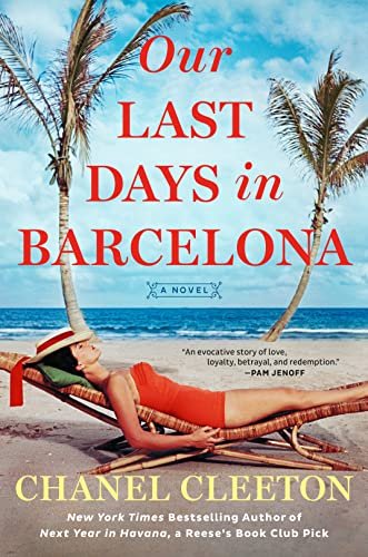
Today’s guest for the CRAP is Chanel Cleeton, author of Our Last Days in Barcelona. Chanel is the New York Times and USA Today bestselling author of Reese Witherspoon Book Club pick Next Year in Havana, When We Left Cuba, The Last Train to Key West, and The Most Beautiful Girl in Cuba. Originally from Florida, Chanel grew up on stories of her family's exodus from Cuba following the events of the Cuban Revolution.

Did you have any pre-conceived notions about what you wanted your cover to look like?

I have a difficult time visualizing covers, but I am fortunate that the art department at Berkley Publishing is always amazing at taking my novels and depicting them so wonderfully. I did know that I wanted the cover to match the style of my other books featuring Perez family members while still capturing the essence of this novel. Sarah Oberrender has designed many of the covers for this series including Our Last Days in Barcelona and I’ve loved them all!

How far in advance from your pub date did you start talking covers with your house?

My editor and I started talking about cover ideas about a year before my release date.

Did you have any input on your cover?

I did! I’m fortunate that my publisher is great about wanting to make sure I’m happy with my cover. At the onset, they ask me for cover ideas, character descriptions, and any reference images or things I want to share with them that will be helpful. Having worked on a few books and having seen their gorgeous covers, I trust their instincts, so I usually just give some general ideas and provide some information about the book. I love seeing their finished product.

How was your cover revealed to you?

My editor emailed me the final cover to get my opinion.

Was there an official "cover reveal" date for your art?

There was! My first Perez family novel, Next Year in Havana,, was a Reese’s Book Club Pick, and Reese’s Book Club has been such a supportive community with my work. They revealed the cover for me on their social media about eight months before the release.

How far in advance of the reveal date were you aware of what your cover would look like?

 I believe I saw the cover about three months before the cover reveal date.

Was it hard to keep it to yourself before the official release?

Yes! It is always so hard to keep it yourself. I tend to look at the cover image over and over again myself before the release because I’m so excited!

What surprised you most about the process? 

I really love seeing how the art department interprets my books. I mentioned before that I don’t necessarily visualize my covers, it’s just not a skill set of mine, so there’s something really exciting about seeing how they put it together.

Any advice to other authors about how to handle cover art anxiety?

I’d communicate as much as possible from the beginning if you have a specific vision or things that are important to you about the cover. Having images that the art department can use as inspiration is helpful to give them a visual representation of your cover. I also think it’s great to consult the different departments involved in selling your book to get their opinion on the cover. They often have insight on what types of covers are doing well. I also recommend speaking up if there’s a cover you don’t love. It is a process and sometimes it takes a few tries to get a cover that everyone is happy with. Your agent can be a great advocate here on your behalf. If you’re able to share with some trusted friends that can be another way to get other perspectives on the cover. Ultimately, there’s only so much we can control in the publishing process so there is a sense of hoping for the best, but at the end of the day, the part we can control—the book—is always the most important thing so I think it helps to remember that.